All articles
Web DesignJune 11, 2026· 5 min read
What actually belongs on your home page (and what to cut)
By Maya Torres
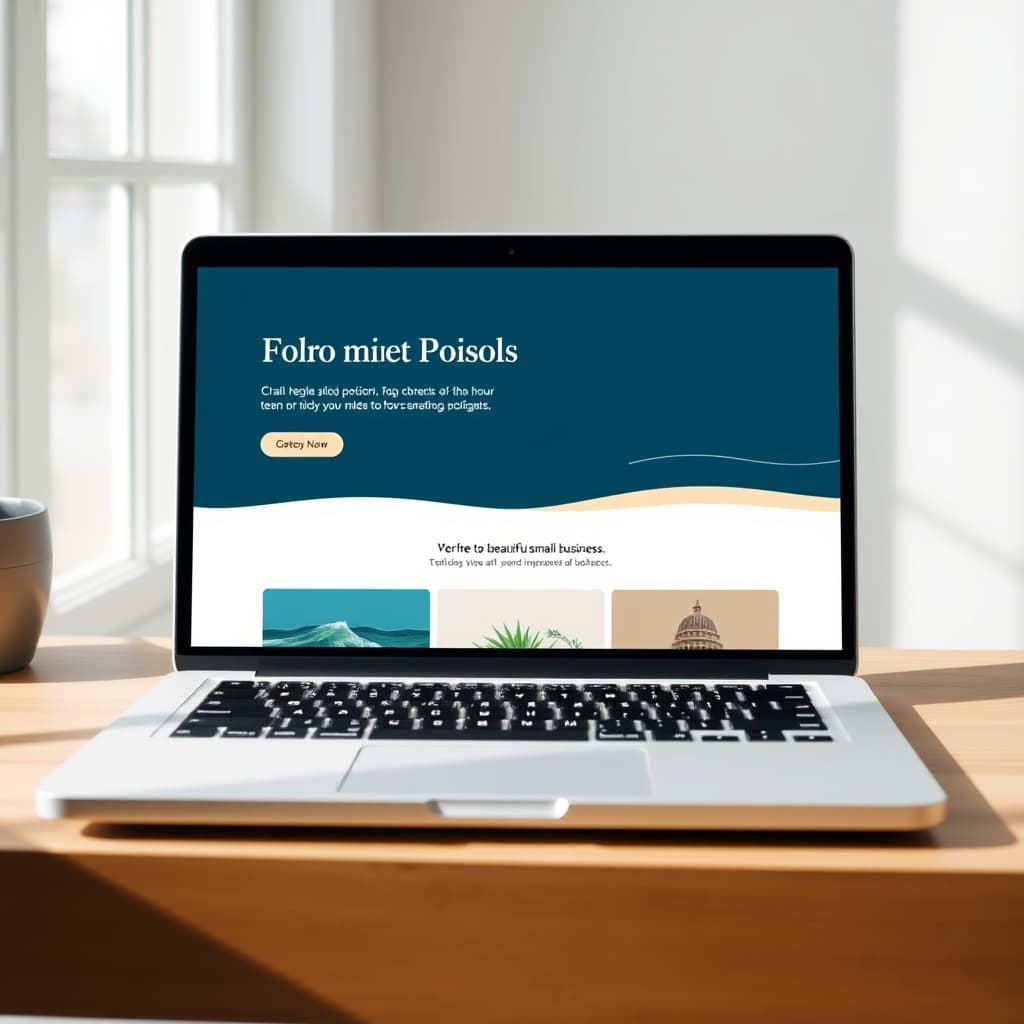
A home page isn't a brochure — it's a decision aid. A visitor lands, asks three silent questions, and either stays or leaves. Your job is to answer all three above the fold.
The three questions every visitor asks
- What is this? Say plainly what you do and who you serve. "Family-owned plumbing in Riverside" beats a clever slogan every time.
- Is it for me? Show the work, the place, the people. Real photos build trust faster than any amount of copy.
- What do I do next? One obvious action — call, book, get a quote — repeated as they scroll.
The short list of what earns its place
- A clear headline that names what you do and where
- A single, prominent call-to-action (the same one, a few times)
- Proof: reviews, ratings, a few real photos
- The essentials: hours, service area, phone — easy to find
What to cut
Auto-playing sliders, walls of text, stock photos of people who aren't you, and "Welcome to our website!" Every extra element competes with your call-to-action and slows the page down.
The rule of thumb
If an element doesn't help the visitor decide to contact you, it's decoration. On a small business site, decoration is a liability — it's one more thing between a customer and the phone.